Logo Sizing
The recommended minimum reproduction size of the SNU logo is 1.25’’ in width. Reducing the logo further would compromise legibility and the integrity of the logo reproduction. For digital reproduction, the target width of at least 140 pixels.
Safe Zones
The safe zone of the SNU logo is intended to maintain the logo’s integrity and to avoid visual confusion. No other type or graphic element (including folds, trims, or edges) should fall within the safe zone shown.
The safe zone on all sides of the logo is equal to the width of the arm of the letter “U,” including serif.
Obtaining the Logo
Logo files can be obtained by contacting the SNU Creative Development Group at brand@snu.edu.
Reproducing the Logo
The Southern Nazarene University logo is comprised of customized graphics and type. The University requires that digital files be used for all forms of reproduction. Any attempt to recreate the art, type, spacing, or styling of the logo could result in inconsistencies in reproduction, which would compromise the integrity of the logo.
Logo Colors
The official colors of Southern Nazarene University’s institutional logo are Pantone 201 and Pantone Black.
Color Matching
When reproducing the logo in four-color process (CMYK) for print or three-color process (RGB) for digital display the following formulas should be used to best match “SNU Crimson” and “SNU Black”:
SNU RED
Print
PMS: 201
CMYK: 0.100.65.34
Web
RGB: 132.22.23
HEX: #841617
SNU BLACK
Print
PMS: Black
CMYK: 0.0.0.100
Web
RGB: 35.31.32
HEX: #231F20
Full Color Reproduction
Adhering to the following color reproduction guidelines will create a consistent image and maintain the visual impact of the logo. When printing over a white or light background, the logo should be reproduced in full color. On a solid dark background the logo should be knocked out in white. The reversed white logo is a separate mark created specifically for dark backgrounds.
The reversed white logo is a separate mark created specifically for dark backgrounds.
Correct Logo Usage
Correct Logo Usage
Incorrect Logo Usage
Incorrect Logo Usage
When appearing on a photo background, the following rules should be followed:
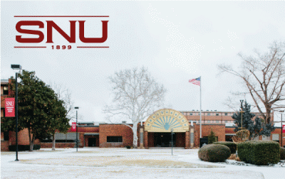
Printing on Light Photographs: On light photographs, a PMS or CMYK logo should be placed in a light untextured area for maximum legibility. It is recommended that the background be no darker than 20% in value.
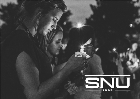
Printing on Dark Photographs: On dark photographic backgrounds, the reversed white logo should be used for maximum legibility.
Single Color Reproduction
Adhering to the following color reproduction guidelines will create a consistent image and maintain the visual impact of the logo. When appearing on a light background, the logo must be printed in black. When appearing on a dark background, the reversed white logo should be used for maximum legibility.
Correct Logo Usage
Incorrect Logo Usage
Incorrect Logo Usage
Correct Logo Usage
Web Reproduction
When appearing on a web page, follow the same rules outlined for full color and photo backgrounds.
The Southern Nazarene University logo is the primary visual identity mark of the institution and is to be used on all stationery, merchandise, printed publications, and digital applications intended for on and off-campus use. Please take a moment to familiarize yourself with the logo usage guidelines. Directions to access logo digital files are located on the downloads page.
